Overview
This is my personal research project about analyzing the market order-by-order using snapshot of ITCH message from Osaka Exchange.
This dataset allows you to analyze every maker orders that was visible on the order book.
Related Github Repositories
Research Question
-
Is it true that high-speed orders are more likely to get canceled?
Yes, this is true.
Slower orders is more likely to be executed. -
Do market liquidity provide any information on market movement?
There are more trading opportunities when market is more liquid.
-
It is said that taker orders are driving force in the market; Is it true?
Statistical summary shows that distributions are different when there is a trading opportunity. (i.e. before large market move)
-
Can you predict the market movement using publicly available machine learning model with the data generated above?
No, I couldn't make it work.
I tried it by using machine learning model that worked well for financial market competition on kaggle.I think it would've been better to model it as a stochastic process whose probability distribution evolves over time.
Dataset
Dataset is the snapshot of ITCH protocol message distributed on March 2021 at Osaka Exchange.
ITCH is a message format widely adopted by financial exchanges and it is tailored for distributing information to market participants.
Dataset consist of over 45 billion records and size of the data exceeds 200GB.
For my particular dataset, it contains the information necessary to rebuild the order book for every products available; This includes, options, futures and combination products(calendar spread).
Software and Technical Infrastructure
Data is processed on AWS using EC2 Spot Instance and Fargate Spot Instance scheduled by AWS Batch.
Kaggle Dataset
As part of my senior thesis, I made some of the dataset I'm using for this project partially available online.
Research Question 1: Speed and Execution Rate
It is said that orders from HFTs are more likely to be deleted, instead of getting matched with another order.
Do faster orders get deleted more often?
Dataset
This chapter only uses the data from March 1st. You can find my dataset on kaggle.
Link: dataset
There is a notebook on kaggle which does something simliar to what I did on this chapter.
Link: notebook
Overview
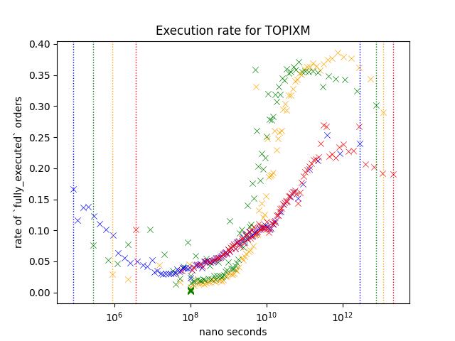
Take a look at a scatter plot below.
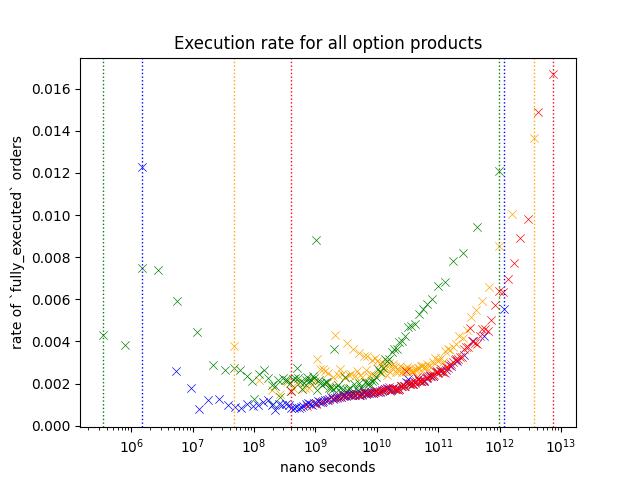
Each scatter plot points represents a probability of an order within a specific range to be fully matched before it is removed or the business day has ended.
To visualize how the likeliness of an order changes under different cirumstances, I have plotted out different variables/subset in different color.
I'm going to call the probability of order to be fully_executed as Execution Rate
Each data point represents,
\[ P(X,A) = n(A_n)/n(S(X)) \]
Where,
- \(S(X)_n\) = Observations whose's value is in \((n, n+1]\) percentile.
- \(A(X)_n\) = Number of executed orders within \(S(X)_n\)
- \(n(S_n)\) = Number of observations in \(S_n\)
- \(n(A_n)\) = Number of observations in \(A_n\)
- \(1 \leq n \lt 100\)
I have considered some alterantives;
- Cumulative Probability with line plot
I concluded that this would not be ideal when you want to figure out how it is like on different intervals. - Lineplot of KDE
There are few ways to pick the smoothing and this will greatly affect how the data will be presente; While, I thought that I could just put multiple plots with different smoothing values, it would be pretty messy
Each color represents different variables;
-
Blue
Blue is based on how long order stayed on the order book.
It only includes orders that is deleted or fully matched.For example, if an order that is deleted or fully matched on 10:30 was inserted on 10:00, then the value for blue is 1.8e+12 nanoseconds or 30 minutes.
-
Red
This is same as blue except that it include orders that was modified at least once. -
Yellow
Yellow is based on the longest time between order events.
For example, if the order was inserted on 10:00, modified on 10:01, 10:05, then this value is 4 minutes (or 2.4e+11 nano seconds), because between 10:01 and 10:05 is longest wait time.
-
Green
Yellow is based on the longest time between each order events.
For example, if the order was inserted on 10:00, modified on 10:01, 10:05, then this value is 1 minutes (or 6e+10 nano seconds).
Yellow and Red can only be observed when the order is modified. I added Green to see if it is the modification that is making the difference or not.
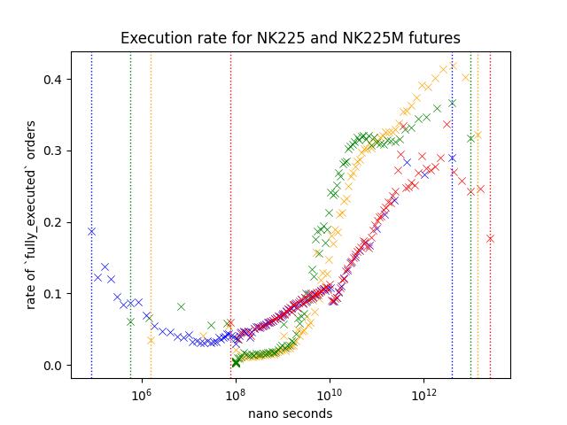
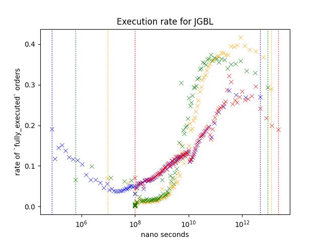
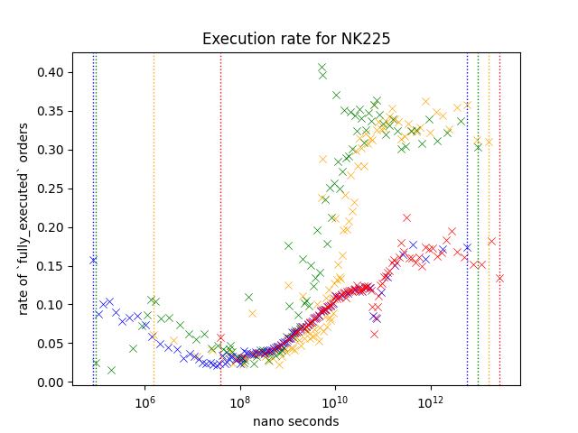
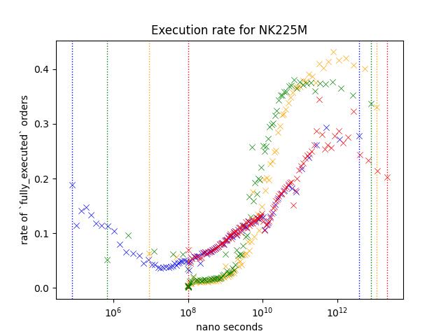
Result1: Nikkei 225 and Nikkei 225 Mini Futures
Let's take a look at orders from NK225/NK225M. Nikkei futures are the most actively traded rroducts on Osaka Exchange.
Execution rate is noticably higher for slower orders. Yellow/Green shows higher execution rate but since Red is not as high as those two variables, I belive that this indicates that number of times it was modified is not the reason behind the higher execution rate.
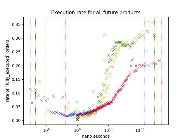
Result2: Future Only
Shape of the plot looks similar to Nikkei 225/Nikkei 225 Mini futures.
I believe that the reason that execution rate is lower across different speed is because the data includes a lot of low-volume products that are dominated by market makers.
Result 3: Options Only
This plot is same as the one shown on the start of this chapter.
Execution rate of options are lower compare to futures, and I believe this is because it includes a lot of inactive contracts like deep ITM/OTM options. Most active contracts are the ones around ATM.
Slower/faster orders shows a higher execution rate just like other orders, but execution rate of slower orders are lower compared to futures.
Additionally, we see a slight increase in execution rate for Yellow around 10^9 ~ 10^10 nano seconds.

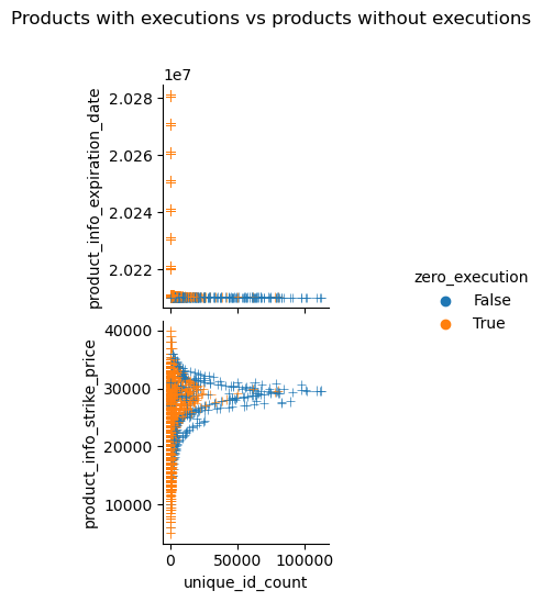
This plots out the number of maker orders observed and the strike price of each optio:n contracts. It shows that there are more maker orders around ATM and contracts that experienced execution during the business day is more likely to have more maker orders.
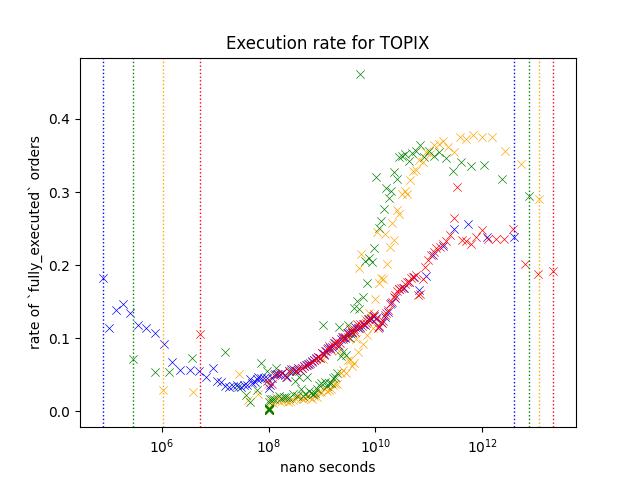
Result 5: Comparison of products at nearest expiry; JGBL/NK225 Mini/NK225/TOPIX/TOPIX Mini
JGBL, NK225 Mini, NK225, TOPIX and TOPIX Mini is the most active products. Following plot is based on the aggregate of orders appeared during March 2021.
JGBL has a mini variant but I decided to exclude it since daily volume is very small.
Every product shows similar pattern;
- Execution rate is higher when the order is slower. (Especially (> 10^10) )
- Execution rate of blue/red is lower than green/yellow for slower orders (> 10^10) while this is not true when the speed is between 10^8 and 10^10.
However, difference between blue/red and green/Yellow is different depending on the product. For example, execution rate of orders around 10^12, red/blue is less than half of green/Yellow for NK225, but it is somewhere around the two third on JGBL.
I think this difference might be coming from those trading these products;
NK225 Mini can be traded through many retial brokers, along with affordable collateral requirements, it is known as the product very popular among retail traders. NK225 requires higher collateral requirements, so I think You can assume that many orders are coming from those trading at a professional capasity.
TOPIX products are in the similar situation as well.
For JGBL, as most retail brokers does not offer this product I think it is reasonable to assume that majority of orders are coming from those trading at a professional capasity.
Future Direction
I believe that this can be used for predicting volume, direction... etc.
I believe that order analysis gives an interesting insight into market. Here are few things that I believe that I can do to get a better insight;
-
Analyzing event-by-event
We used an aggregate of order events (update, creation, deletion).
This approach simplfies the data; While this make things simpler, you are missing out lots of the information that could've been used. -
Order flow prediction
We've seen different product showing different pattern. I think you could elavorate on this to identify order flow.
For example, we know that Game Stop was very very popular among retails especially around the great short squeeze. But we cannot say the same for things like SOFR futures or Euro dollars futures; As far as I'm concerned, no one on wallstreet bets is talking about rate products.
-
Better plotting
I used scatter plot believing that this is better than other methods that I could come up with.
I'm pretty sure that there are better ways to do this, and I'd love to further explorer this domain.
Research Question 3: Depth Imbalance
Summary
- Market tends to offer more trading opportunities when order book is more liquid; However, there are some details to it
- Market depth is what the average execution price of FOK market order would be at given tick of an orderbook
- Market liquidity is measured in difference between average execution price of market order of size Q1, and Q2 (Q1 < Q2)
Overview of Data
Market Depth
Image below is the visualization of market depth at different quantity.
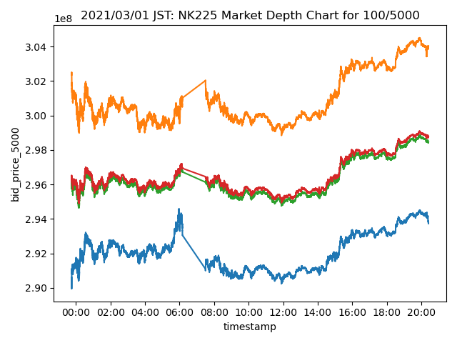
We measure this by the calculating what the average execution price of an market order of size Q would be.
Say we had a order book that looked like this;
| ask | price | bid |
|---|---|---|
| 1000 | 500 | |
| 1000 | 400 | |
| 300 | ||
| 200 | 1000 | |
| 100 | 1000 |
Market Depth of size Q would be,
| Q | Ask | Bid | Note |
|---|---|---|---|
| <= 1000 | 400 | 200 | You can fill first 1000 contracts with BBO. |
| 1250 | 420 | 180 | You can't fill the order with BBO, so you acquire 250 contracts on the next price level. |
| 1500 | ≒433 | ≒166 | 500 on the next price level. |
| 1750 | ≒442 | ≒157 | 750 on the next price level. |
| 2000 | 450 | 150 | 1000 on the next price level. |
For the first plot, Orange/Blue is for MarketDepth(Q = 5000) and Green/Red is for MarketDepth(Q = 100).
Price on the yaxis says it is traded at 3e8 JPY.
This comes from ITCH protocol's data representation.
They don't have decimal points in the price field, instead they give you a separate meta data that tells you where to put the decimal point.
Last 4 degits are the fractional number, except for JGBL. In case of JGBL, last 3 are the fractional.
Depth Imbalance
Here is a visualization of depth-imbalance.
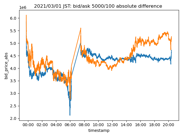
This is measured by subtracting market depth of size Q1 from Q2.
Say we had a order book that looked like this (same as previous exmaple).
| ask | price | bid |
|---|---|---|
| 1000 | 500 | |
| 1000 | 400 | |
| 300 | ||
| 200 | 1000 | |
| 100 | 1000 |
Let Q1 = 1000, Q2 = 2000.
Our values are,
| side | q1 | q2 | depth imbalance |
|---|---|---|---|
| ask | 400 | 450 | -50 |
| bid | 200 | 150 | 50 |
So, our depth imbalance is -50/50 at this given moment, and depth imbalance spread is ((50 - (-50) = 0)).
On the plot that I shown to you, I use the absolute value of ask to make it look prettier.
Aggregating Depth Imbalance
Visualizing whole month of time series data would require a large monitor and my monitor isn't big enough.
We are going to aggregate the values.
Take a look at the image below.
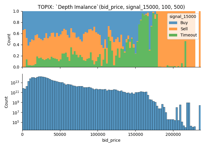
- Plot above shows the ratio of data points which offers
Each data point is assigned a categorical valuesignalwhich takes one of three value;Buy,SellorTimeout
| Value | Condition |
|---|---|
| Buy | If you buy the contract at ask price, you can turn X point of profit by selling at bid price in next 3600 seconds |
| Sell | If you sell the contract at bid price, you can turn X point of profit by selling at ask price in next 3600 seconds |
| Timeout | None of the condition were met. |
Buy, Sell and Timeout is same as the signal variable discussed on Research Question 3: Taker Orders.
-
Plot below shows the number of observations.
Each data point is weighted by the duration of state. -
Filtered data points
There were many cases where order book didn't have enough orders to fill an order of size Q. These observations are filtered.
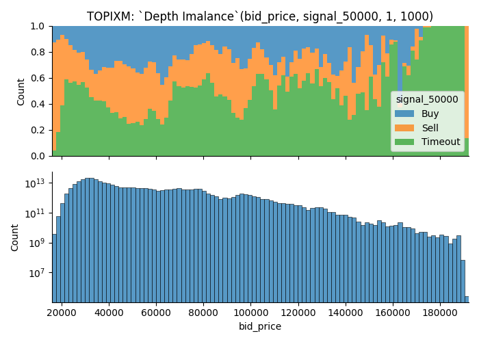
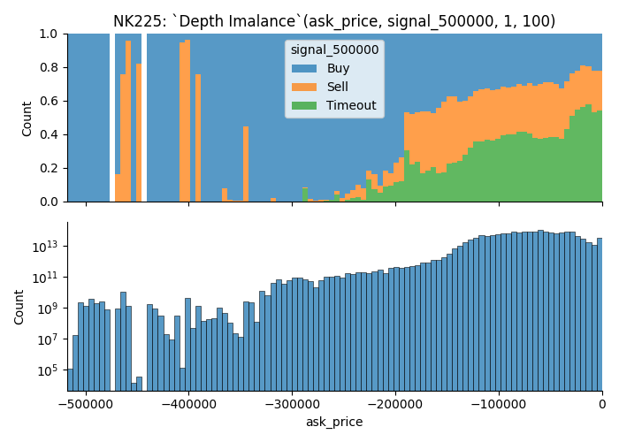
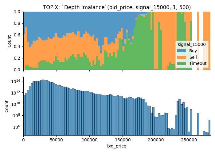
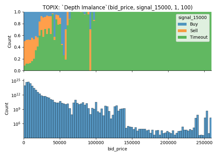
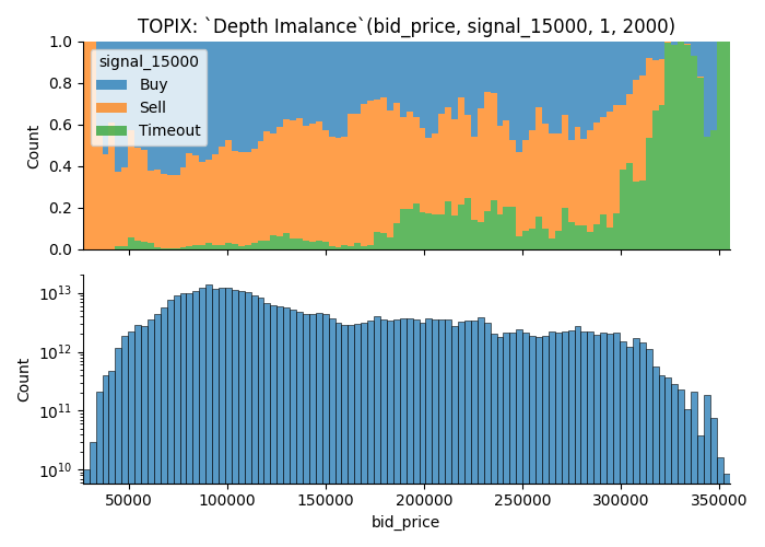
Title of the plot shows the parameters. In this case, it means,
Q1, Q2 = 100, 500- Future this plot visualize is
TOPIX, - It uses orders found on
bidside to plot out the value - When the market moves for greater than or equal to
1.5000 pointsin either direction within 3600 seconds, data point is marked asBuyorSell.Timeout, if it doesn't move1.5 pointsin 3600 seconds.
From the plot, you can learn that;
- There are more trading opportunities when the depth imbalance is closer to 0, i.e. more liquid.
- You can see that signal dominating the tail of the distribution; I think this comes from some kind of outlier since we only have small number of observations.
Here is another example.
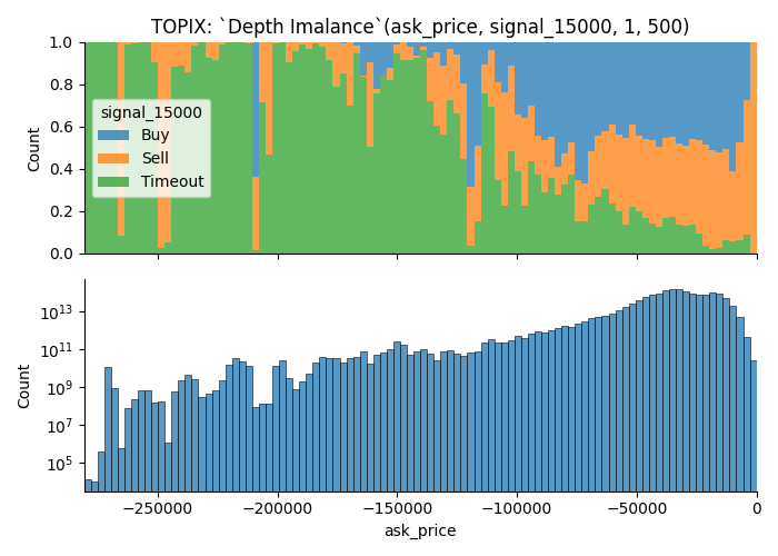
 Parameters are,
Q1, Q2 = 1, 1000- Product is
TOPIX Mini. (TOPIXM is the name meta data uses on ITCH message) - It uses orders found on
askside to plot out the value - When the market moves for greater than equal to
5.0points in either direction within3600 seconds, data point is marked asBuyorSell. Otherwise it'sTimeout.
Results
Is the market more likely to move when the order book is liquid?
Yes, but there are some context too it.
In general, you are more likely to run into a trading opportunity when order book is nice and liquid.
- Some orders gives more trading opportunity when it shows larger order depth
- I removed moments where order book was not sufficient to fill large order;
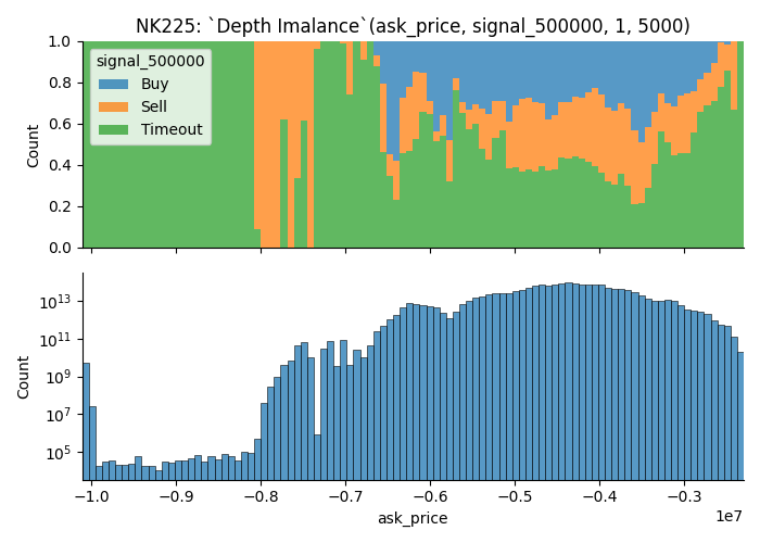
Let's start with examples that shows rate of Buy/Sell group increases (i.e. More trading opportunities) as market becomes more liquid.
They are the visualization of deeper area of order book.
It shows that market is more likely to move when the depth imbalance is closer to 0.
Let's take a look at some examples.
More trading opportunities when the depth imbalance is closer to 0
- with Deep Orders
- Sallower Orders Only
More trading opportunities when the depth imbalance is further from 0
- With Deep Order
- With Shallower Orders
- Without Shallower Orders
Trading opportunities on less-commonly observed values
I discovered that there are examples where you get higher chance of trading opportunities when variable takes a less-commonly observed value.
I'm suspecting that this is an affect of some kind of outlier.
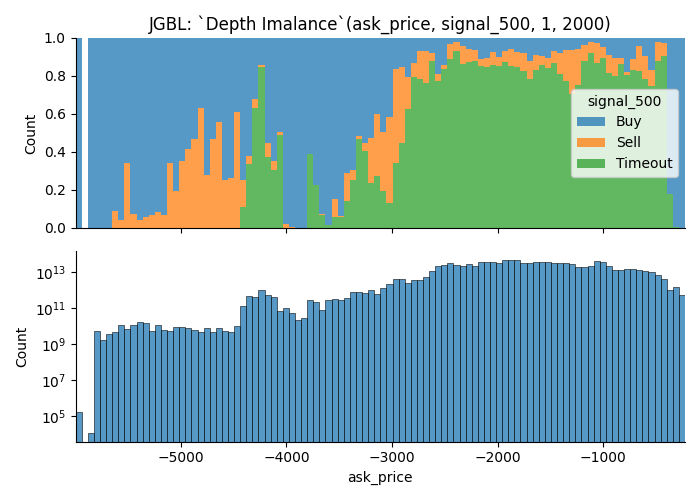
Examples how removal of illiquid moments affect the visualization
As I disucssed previously, data points where the orders aren't fill-able is removed from the data used to visualize.
Take a look at the images below.
There are many observations that couldn't fill an order of size 2000; As a result, latter plot has lots of data points removed from the visualization, yet it gets more buy/sell groups.
This visualization is not good at helping
Future Direction
I think liquidity is something you can look at to understand market movement, and here are some list of things that I think that I can use to figure out. Here are some list of things that I
-
Normalization
I used absolute difference between market depth; This would works with different market structure.
This wouldn't work on longer time scale and it made it rather difficult to compare it against one another.I need to normalize it.
-
Calculate confidence interval to figure out how many observations you need to use this data for predicting market move
-
Do total number of orders/contracts available on order book affect the market in anyway?
We learned that order book may not have enough orders to satisfy large orders at given point in time.
I simply filtered these observations for this project but there should be something you can learn about it. -
Clustering orders by different quantity/speed or other factors
Over 99% of maker order's size is less than10, and most of them are just1.
However, there are some orders whose size is as big as 5000.Large order can have strong influence over the metric I used.
There might be something that I can laern by filtering large orders.
Also, I might be able to learn something by the behaviour of larger orders too.
Research Question 3: Taker Orders
Summary
- I measured taker orders' activity by it'S aggregated unrealized profit, volume and profitability of their position at maturity on each tick
- Products that I analyzed are Nikkei 225, TOPIX and Japanese Government Bond Future; For Nikkei 225 and TOPIX, mini variant included with appropriate weight.
- I grouped each data points by how the market moved in next 3600 seconds.
- Statistical summary reveals that underlying distribution of data points are different prior to market move
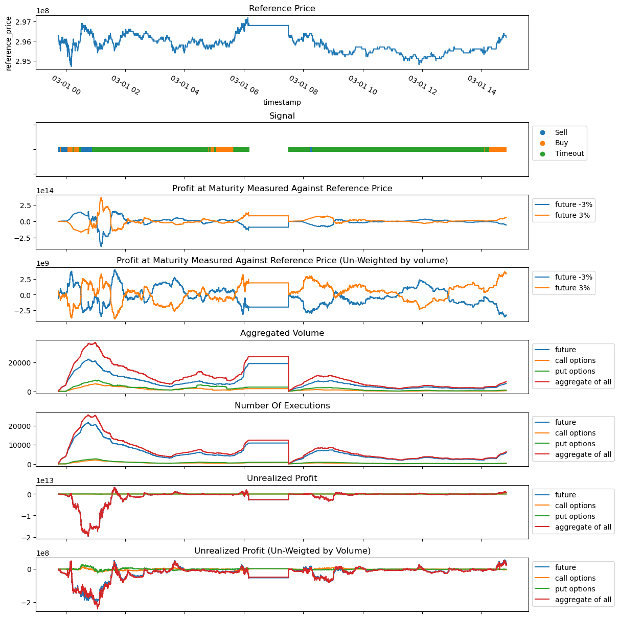
Visualized Overview of Generated Data
Below plot is the visualization of generated data.
-
Reference Price
Reference price tracks the execution price of the future contract. -
Signal
This is a categorical value that takes one of 3 value.
Value Condition Buy If you buythe contract atask price, you can turnXpoint of profit by selling atbid pricein next3600 secondsSell If you sellthe contract atbid price, you can turnXpoint of profit by selling atask pricein next3600 secondsTimeout None of the condition were met. -
Profit at Maturity Measured Against Reference Price
This tracks taker's profit at maturity, it uses reference price as hypothetical final settlement price.Say, in last
Tseconds, we observed following transactions.Product Taker's Side Quantity Strike Price Transaction Price Transaction Time Future Buy 10 --- 19,900 10:00 Mini Future Sell 10 --- 20,100 11:00 Call option Buy 10 20,000 500 10:30 Put option Sell 10 20,000 300 10:25 When the reference price is 20,000JPY, value at maturity would be,
Moneyness Future Mini Future Call option Put option -3% (19,400) -5,000 700 -5,000 -3,000 -2%(19,600) -3,000 500 -5,000 -1,000 -1%(19,800) -1,000 300 -5,000 1,000 0%(20,000) 1,000 100 -5,000 3,000 1%(20,200) 3,000 -100 -3,000 3,000 2%(20,400) 5,000 -300 -1,000 3,000 3%(20,600) 7,000 -500 1,000 3,000 -
Profit at Maturity Measured Against Reference Price un-weigted by volume
Say, in last
Tseconds, we observed following transactions (same as the previous example).Product Taker's Side Quantity Strike Price Transaction Price Transaction Time Future Buy 10 --- 19,900 10:00 Mini Future Sell 10 --- 20,100 11:00 Call option Buy 10 20,000 500 10:30 Put option Sell 10 20,000 300 10:25 When the reference price is 20,000JPY, value at maturity would be,
Moneyness Future Mini Future Call option Put option -3% (19,400) -500 70 -500 -300 -2%(19,600) -300 50 -500 -100 -1%(19,800) -100 30 -500 100 0%(20,000) 100 10 -500 300 1%(20,200) 300 -10 -300 300 2%(20,400) 500 -30 -100 300 3%(20,600) 700 -50 100 300 -
Aggregated volume
This is the aggregated volume within a time window.
-
Number of executions
This tracks the number of executions observed.
-
Unrealized Profit
Say, in last
Tseconds, we observed following transctions (same as the previous example).Product Taker's Side Quantity Strike Price Transaction Price Transaction Time Future Buy 10 --- 19,900 10:00 Mini Future Sell 10 --- 20,100 11:00 Call option Buy 10 20,000 500 10:30 Put option Sell 10 20,000 300 10:25 Unrealized gains at given best bid/ask is;
Product unrealized gains best bid best ask Future 11,000 21,000 21,100 Mini Future 9,000 21,000 21,100 Call option 10,000 1,500 1,700 Put option 10,000 100 200 -
Unrealized Profit (Un-Weigted by Volume)
Say, in last
Tseconds, we observed following transactions (same as the previous example).Product Taker's Side Quantity Strike Price Transaction Price Transaction Time Future Buy 10 --- 19,900 10:00 Mini Future Sell 10 --- 20,100 11:00 Call option Buy 10 20,000 500 10:30 Put option Sell 10 20,000 300 10:25 Unrealized gains at given best bid/ask is;
Product unrealized gains best bid best ask Future 1,100 21,000 21,100 Mini Future 900 21,000 21,100 Call option 1,000 1,500 1,700 Put option 1,000 100 200
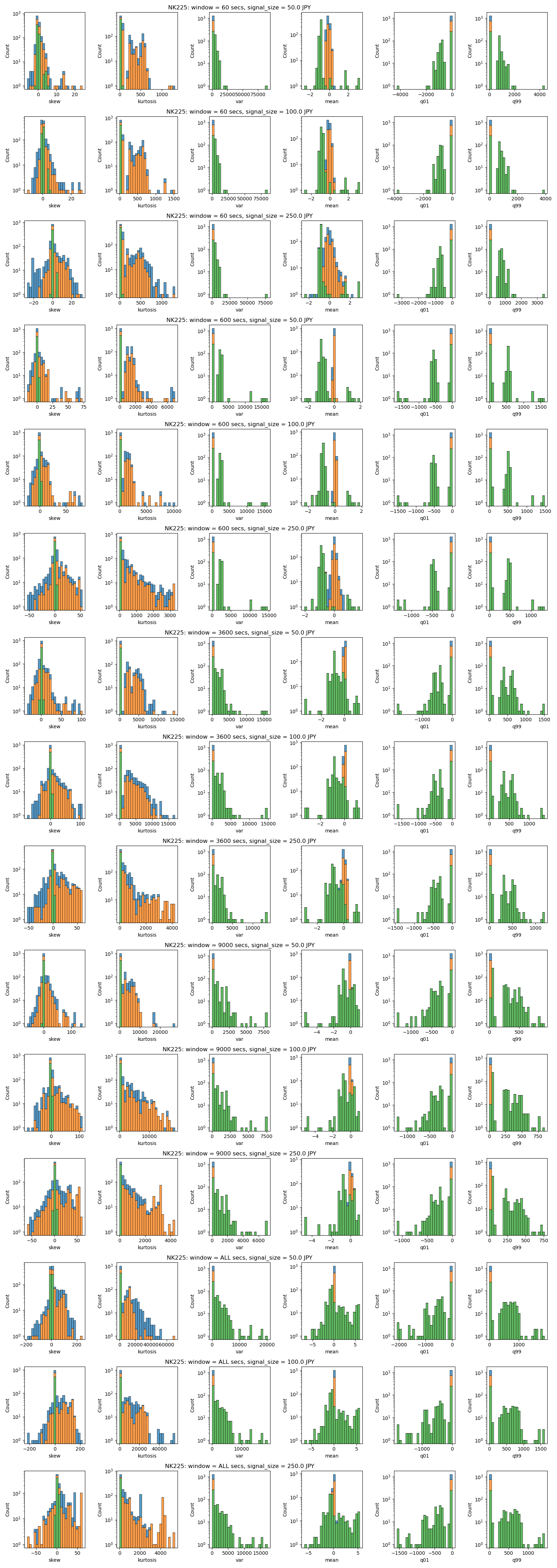
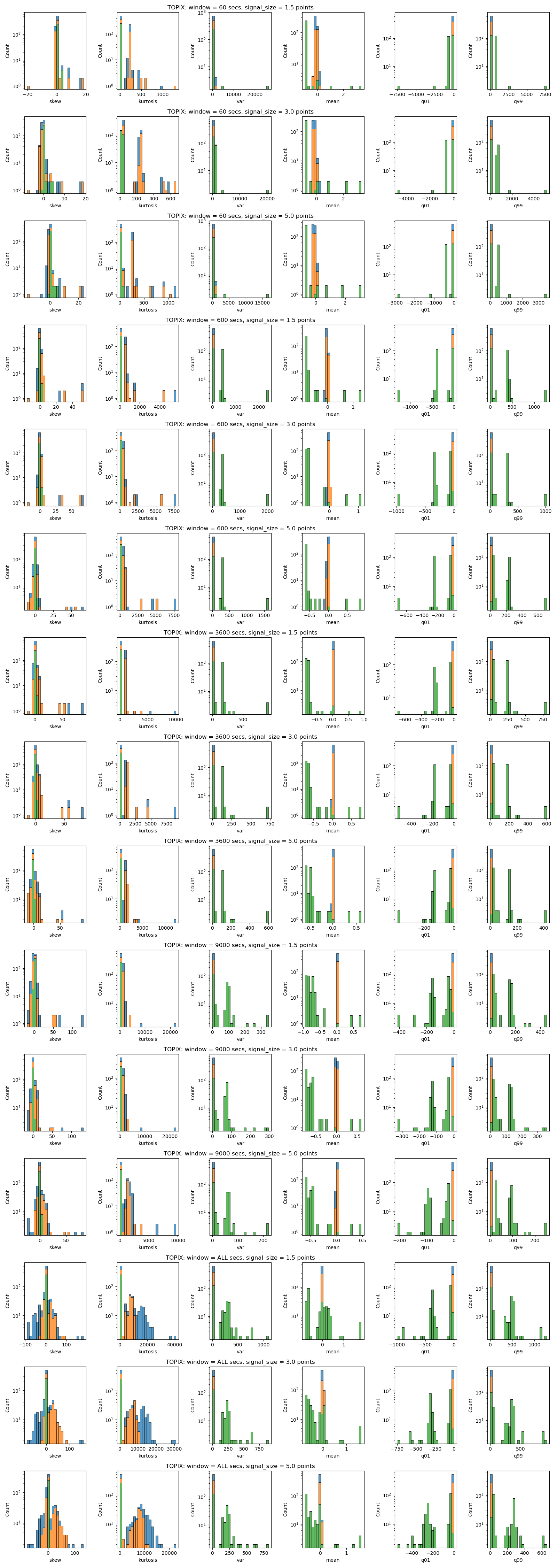
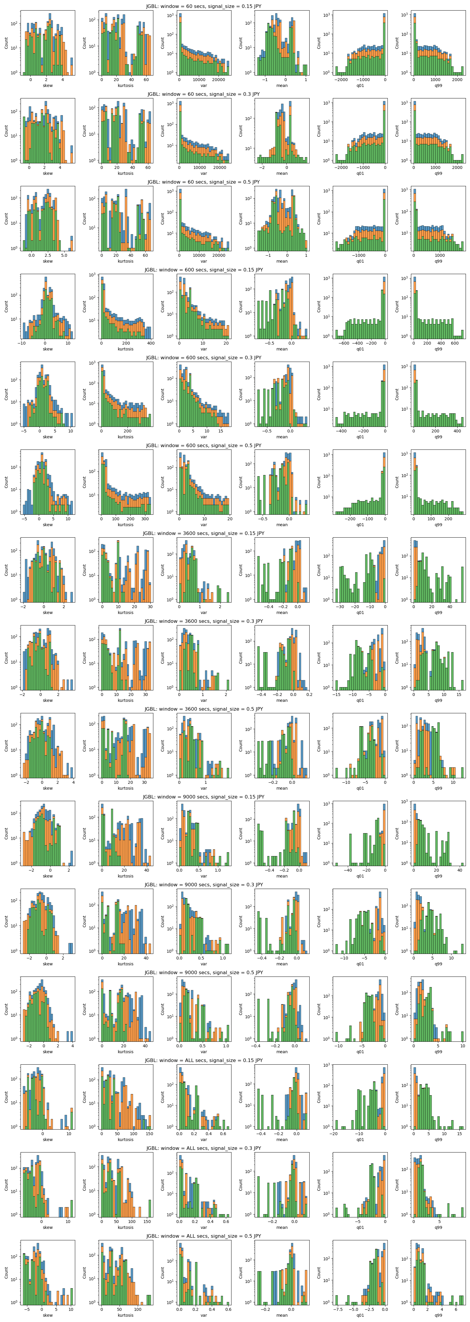
Result
I calculated the summary statistics of each variables after grouping each data points by it's signal. Data is normalized by,
-
converting each data point into percentile changes of it's previous data.
e.g.
after original data 0 nan 10 1 0.1 11 2 -0.181818 9 -
removing outliers
Any data point that is not between 1% ~ 99% percentile is filtered.
-
removing data points that did not change
There were many data point which did not change from the previous value. Any data point that is
0is removed.
To sum up, I can say the following for each variable;
- Skew, Kurtosis
- For most variables, Skew of Timeout group is somewhere around 0, while skew of Buy/Sell group shows more variance.
- Mean, Variance, 1st percentile and 99th percentile
- Buy/Sell group tends to be close to 0
- Some Timeout groups have larger/smaller value
- Product Difference
- NK225
Compared to other products, Buy/Sell and Timeout has less overlap.
It can be said that this is coming from it's Japan's most active options market. - JGBL
Overlap between Timeout group and others are more significant on JGBL, I'm suspecting that this is due to the smaller number of taker orders. - TOPIX
TOPIX's variable looks less scattered, this is coming from the lack of activity in it's options space.
Option related variables are removed.
- NK225
Here is a plot that shows the aggregate of statistical summary of the data for each product.
From left we have skew, kurtosis, variance, mean, 1% percentile and 99% percentile of the data.
The title tells you the parameter. For example, the first row says "NK225: window = 60 secs, signal_size = 50.0 JPY". This means, the plot uses Nikkei 225 future data, with window size of 60 seconds, and signal size of 50 JPY.
Visualization of Statistical Summary
Nikkei Future
TOPIX Future
JGBL Future
Research Question 4: Predicting Market Move
Overview
I tried to predict the market move using machine leanring model that was available online.
I couldn't simply download a jupyter notebook and make it work, so I had to make changes here and there, but it's essentially the same as the ML model that took the 1st place on Jane Street Market Prediction.
I trained them using the dataset I used to for other research questions. Labels are the Buy/Sell/Timeout groups that I discussed earlier.
Result
It simply didn't work; Timeout is the only value that trained model ever produce.
Why it didn't work
-
Difference in Dataset
My dataset has different distribution/values compared to what the model was developed for.
Variance is lot smaller and data point is lot larger. -
Scale of the dataset Number variables and data points that my dataset have is significantly larger than the dataset used in kaggle competition.
While I don't think this was the root cause, I think it might have affected in one way or another.
Things that I tried but didn't work
- File size is too big! I tried to improve the algorithm by increasing the number of variables with feature-engineering.
Because the feature-engineering was taking quite a lot of time, I decided create files for feature-engineered values with rust and then process that on ML algorithm written in python.
Total size of feature engineered files saved in parquet format totaled to over 10 TB with strong compression (Level 15 zstd.). I could've reduced the size but it was clear that it is going to take a lots of space.
This also turned the cost of AWS as a primary concern.
How I could've done differently
- Incremental Development
I could've incrementally built my model.
Instead of starting the model building after finishing generating data and feature-engineering the whole thing, I could've tried one by one.
I might not get what I wanted, but I think I would've at least got something.
- Reducing the size of the data
I wanted to process the data with nano seconds presicion because I wasn't able to find any one who analyzes the market in nano seconds precision.
However, I could've grouped the data in seconds or minues to reduce the data size.
Additionally, I blindly applied many different methods when I feature-engineered each features, which is another reason that it turned into a gigantic bunch of files.
Overview of System/Tools/Software
Order Book Simulator
Order book simluator is built from scratch with Rust based on specification provided by Japan Exchange Group.
It works with Osaka Exchange's ITCH procotol message.
Current implementation requires all data to be loaded onto the RAM. The original dataset was not sorted by timestamp and I didn't want to mess around with the data as I was concerned that I might break it without noticing it.
List of things that I can improve is mentioned on future direction.
Cloud Environment
I used AWS, but I believe same can be done in other platform as well.
Here are my reasoning for using S3 over other services.
- Data Storage: Object Storage vs MySQL/PostgresDB vs Serverless databases
-
Object Storage
Least expensive and as long as you keep the file size small, it work.
Schema is not required, so it's not difficult to introduce new data types. -
Server RDBMS (e.g. MySQL, PostgresDB)
Server is quite expensive and query wasn't always as fast.
Since most my dataset was read only so most features were not necessary. -
Serverless DB
You will only be charged for what you use but you could mess up your query and end up with 1000 USD an hour. (it happened to me.) Since most my dataset was read only so most features were not necessary.
-
I almost exclusively used EC2 but this is what I found out about AWS's computing services.
- Computing: EC2 vs Lambda vs Fargate
- EC2
-
Predictable Hardware You know exactly what hardware you are getting. This is important especially when you want to use language like Rust, which compile down to native binary.
-
Wide range of configuration to choose from
-
Good discount with spot instances
-
- Fargate
-
Un-predictable hardware
You don't know what CPU you are getting -
Less configuration is required for Fargate
AWS batch is quite tricky with EC2 but this is not the case with Fargate. -
Slightly more expensive compared to EC2
-
- Lambda
- Works very well if you can divide up your jobs into smaller pieces
- Job must be completed in 15 Minutes
- No spot instance
- Hardware configuration is not flexible
- You can use it with S3 batch operation
- EC2
Future Direction
Order Book
Things that I would do to improve:
- Multi-threading
- Loading Data By Streaming
- Generics To Work With Different Message Format (e.g. FIX format, JSON format from crypto exchanges)
Performance optimization will allow you to,
- work with smaller instance
- allows you to work with smaller quotas
- work in faster iteration
Automate things
- Reducing the file size to allow use of solutions such as S3 Batch operations to further drive the cost down.
- Indexing of generated data
- CI/DC
- Benchmarking... etc
Fun Quiz: long 30 days federal fund rate with covered call
The research question is unrelated to rest of the questions.
This is more of a fun brain teaser than a research project.
So, the Russian commedians pranked J Powell.
It turns out that he is planning for 2 rate hikes and he mentioned that it matches with what the market is pricing in.
Let's see if you can make money out of this.
Three month SOFR rate
Three-Month SOFR is a future contract that tracks the interest rate. Details can be found on CME's website.
While SOFR is not the fed rate itself, it collarates with it. Importantly, it has active options marke unlike 30 days fed fund rate future.
According to the website, the price quotation is,
contract-grade IMM Index = 100 minus R

R = business-day compounded Secured Overnight Financing Rate (SOFR) per annum during contract Reference Quarter

Reference Quarter:  For a given contract, interval from (and including) 3rd Wed of 3rd month preceding delivery month, to (and not including) 3rd Wed of delivery month.
Formula for measuring theoretical price for future contract is; \((TheoreticalPrice = [100 - R] - [r (x/360)]\))
Meeting Probabilities
According to FedWatch tool on CME, probability of fed hikinng on 6/14/2023 meeting is just over 90%. No change is at 10%.
Meeting probability is;
| Rate Range | 475-500 | 500-525 | 525-550 |
|---|---|---|---|
| Probability | 9.5% | 68.7% | 21.8% |
Current price of Jun 2023 contract is 94.915; So, you are not going to lose money as long as the rate sticks at 5.085% or lower.
Covered Puts/Calls
Assuming that rate will fall between 475 and 550, we can make a guranteed profit if we could build a position that doesn't lose moeny as long as it ends between them.
https://www.barchart.com/futures/quotes/SQM23/options/jun-23
Let's take a look at the options market.
Here is the screen shot of the website.
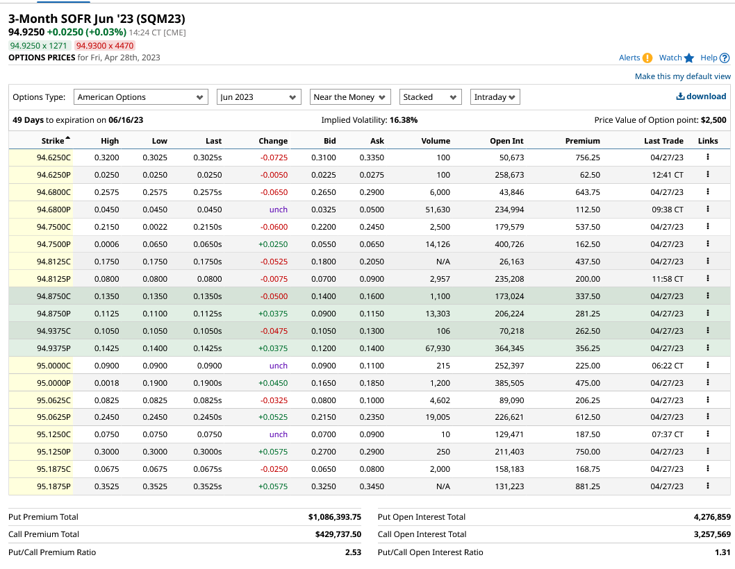
So,
- long future and covered call, you can get the break even of 94.9250 - 0.105 = 94.82.
- short future and covered puts, you can get the break even of 94.9250 + 0.12 = 95.045.
So, you can create a position where you'd only lose money the final settlement price becomes,
| covered call | covered put |
|---|---|
| lower than 94.82 (5.25% or above) | greater than 95.045 (5% or lower) |
It feels like both positions offer fair amount of chance to turn a profit.
You can lose money when SOFR goes outside 5% ~ 5.25% range, but this is the most predicted range.
Unless the fed is trying to surprise the market, we should be able to turn a profit or at least not-lose money.
I would've opened a position with covered put if broker allowed me too.
I think you can properly figure out if these positions are going to be profitable or not once you figure out the diviation between SOFR and fed target rate.
Also, you should've been able to have a better chance of success if you were able to trade this before the time decay took away the option's value.
Another think comes up to my mind is a butterfly spread.
Future Direction
I think, with enough time, you can create a sophisticated model that allows you to make money off arbitrage trading. Things that I need to figure out is,
- SOFR vs Fed Traget: How much do SOFR deviate from Fed Target?
- Better model for calculating theoretical price of SOFR futures
- Model how option price evolves over time
- Find out what the tail risks are
Since there are many products like Euro Dollars and T bills which collarates with rates, I think this is an interesting field to look into.